


Andrea’s Cookies Brings Something Sweet to Ossington Avenue


With an elevated design courtesy of StudioAC
Ossington Avenue’s reputation as a bustling hub for design-forward retail keeps growing, and Andrea’s Cookies is the latest addition to cement this status. Designed by StudioAC, the new location for this beloved bakery offers more than just delectable cookies—it’s a compelling case study in the power of architecture and branding to create memorable experiences in even the most compact of spaces.
Led by studio co-founders Andrew Hill and Jennifer Kudlats, alongside architectural designer Sarah Reid, the team has crafted a space that blends function, form and an eye-catching aesthetic, inviting passersby to step inside and indulge.


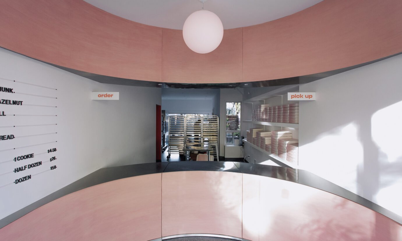
Gradient cookie boxes aren’t just packaging—they’re a design feature, integrated into the wall to create a textural and colorful element that reinforces the shop’s visual identity.
Andrea’s Cookies is no stranger to Toronto’s dessert lovers, having proved its success at its original Bloor Street location. But for its Ossington debut, the bakery wanted to elevate its visual identity, reflecting both its established reputation and its ambition to attract new customers in a competitive retail district. “Andrea’s Cookies came to us ready to make a statement,” says Hill. “They wanted a design-forward presence so that even if someone had never heard of the brand, they’d walk by and think, ‘What is that cool-looking shop?’”
The StudioAC team approached this challenge with a deep understanding of the neighbourhood, a destination they know well through previous projects, including the flagship store for clothing brand Kotn and a residential project just north of Dundas Street. “Ossington is such a high-profile area now, and there’s an expectation for elevated design,” Kudlats notes. “For us, it was about creating something that felt honest to the brand while standing out in a busy, vibrant context.”


StudioAC’s circular layout creates a seamless customer journey, guiding visitors from browsing the menu to pickup while maximizing functionality in a compact space.
With limited square footage to work with, StudioAC prioritized creating an intuitive customer journey within the space. The bakery’s design centers on a striking circular layout, a departure from the more traditional linear formats found in many Toronto cafés. “The circular gesture was functional as much as it was aesthetic,” explains Reid. “It guides customers through multiple touchpoints—the menu, the cookie display, the payment area and the pickup counter—seamlessly, without any confusion or congestion.”
This circular design is reinforced by mirrored architectural gestures above and below, creating a dynamic interplay between the ceiling soffit and the millwork. The result is a space that feels cohesive, intentional, and surprisingly expansive despite its compact footprint. “The flow makes the customer experience feel fluid,” says Hill. “It’s not just about moving through the space but enjoying the interactions at each step.”


Achieving Andrea’s signature pink was a labor of love, with StudioAC and Canfield & Co. experimenting with stains to create the vibrant yet natural hue on the plywood millwork.
The material palette for Andrea’s Cookies reflects a balance of industrial honesty and playful softness. Stainless steel—a practical choice for a working kitchen—provides a sleek, modern foundation. To counterbalance its coolness, StudioAC introduced pink-stained plywood, a bold yet approachable material that defines the space. “Staining the plywood pink instead of painting it was a nuanced process,” Reid shares. “It allowed the natural texture of the wood to come through while giving the space a distinctive, branded identity.”
The pink stain was not an arbitrary choice. “Pink was already part of the brand’s identity, so it felt natural to carry that through the space,” Kudlats explains. “We experimented with various materials—concrete, tile—but plywood offered the right mix of cost-effectiveness and visual impact.” The team collaborated closely with Canfield & Co., the project’s builders, to perfect the stain, ensuring the material’s longevity while maintaining its vibrancy. “Canfield was incredible to work with,” Hill adds. “They were just as invested in getting the details right as we were.”


Mirroring the familiar cookie boxes, StudioAC’s design weaves Andrea’s playful identity into every detail, from the signature pink stain to the packaging that feels like part of the architecture.
StudioAC’s design for Andrea’s Cookies goes beyond the physical architecture to incorporate elements of the brand’s packaging and visual identity. Gradient cookie boxes, a signature feature of the brand, are cleverly integrated into the interior design. “The boxes stack on the walls to create a textural, patterned effect,” says Reid. “It’s not just functional storage—it becomes part of the architecture.” This attention to detail reinforces the interplay between the bakery’s products and its physical space, ensuring that every element feels cohesive.


StudioAC’s philosophy of starting with gestures and functionality is evident in the curved plywood and stainless steel, which create a striking, sensory-forward space that feels both playful and practical from day to night.
For StudioAC, Andrea’s Cookies is more than just another project—it’s a distillation of the studio’s philosophy. “We always start with gestures, function, and sensation,” says Kudlats. “Materials come later, enhancing those initial ideas.” Hill echoes this sentiment: “It’s exciting to see a project like this validate our approach. It’s clean, impactful, and true to our ethos.”
As Andrea’s Cookies opens its doors on Ossington Avenue, it adds another layer of vibrancy to a neighbourhood known for its design-forward retail spaces. StudioAC’s thoughtful, playful approach ensures that this little shop will not only delight customers but also stand out as a shining example of how small spaces can make a big impact.