


A Wallace Emerson Renovation Revamps a 1920s Relic


Blending thoughtful sightlines, bold architectural details and a palette inspired by Canadian art
While many aging builds still stand the test of time, many more feature the boxed-off alcoves, tight entryways and low doorways of single-family homes from a bygone era. In Toronto’s Wallace Emerson neighbourhood, one such 1920s home got its own, much-needed face-lift. Led by local firm Picnic Design, the freshly renovated dwelling greets the modern era in high style.
Although the home was in fairly good shape, the studio’s main concern was the ramshackle rear addition that was tacked on in the fifties or sixties. It needed a new foundation—a painstaking process that involved digging and underpinning—that would lower the floor, expand the basement and widen the blueprint. In the new layout, a roomy basement features a guest bedroom, the ground floor hosts a spacious kitchen and on the top floor, the principal bedroom features an ensuite bathroom. But more than this, the Wallace Emerson home redesign brought a new unity to the space.


“The new edition was an opportunity to rethink how the back is connected to the front. In the old edition, you had to commit to go to a different space. It wasn’t very visually connected and physically, there was just a small doorway,” shares Eric Martin, founding co-principal.

The archway adds a modern touch to the home’s architectural integrity.


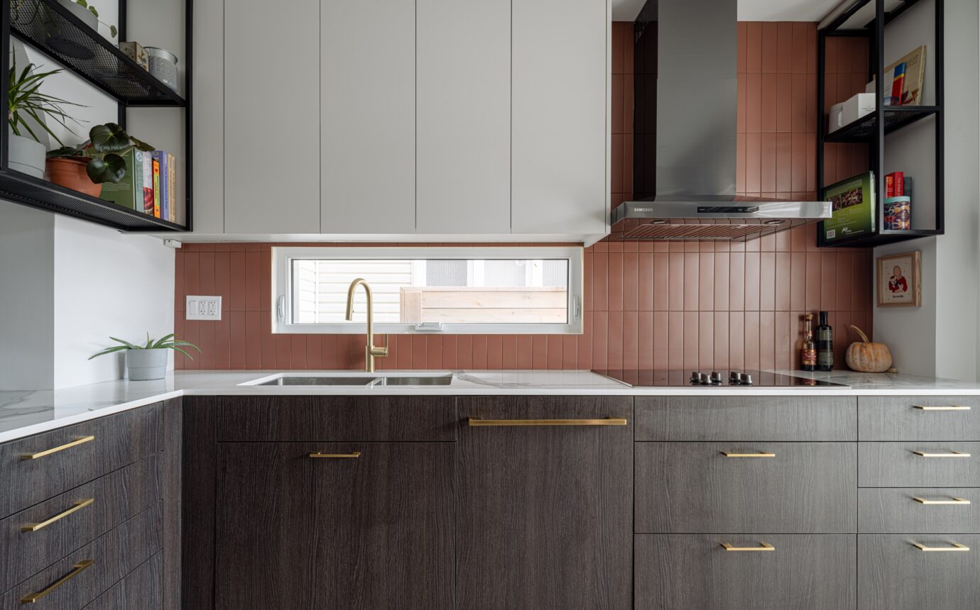
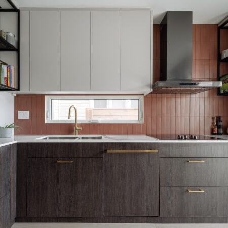
Pink tile makes a case for on-trend colour usage in the kitchen.


Wall-hung shelving saves space and adds an industrial edge to the transitional-style space.


Natural wood warms up the cool window space.
To help bolster the flow, new sightlines were introduced. Standing at the front door, you can look straight past the powder room into the living area and through the kitchen, aided by a black veneer feature wall and tall cupboards that act as a visual thread. Eventually, you end up in a nook with a small bench by the back door, for a moment of pause before exiting. But as much as the sightlines connect the ground floor, the designers still ask you to inhabit the space. Case in point: the archway. Completely opposite to the old layout which boxed off the kitchen with only a small, constricted opening, this open archway invites another moment of pause in the Wallace Emerson home.


Sunlight brings out the warm undertone upstairs.


The second-floor hallway is designed to feel bright and spacious, with a clean and simple aesthetic.


A splash of colour finds its place in all the right corners of the home.
“It’s a fairly thick arch—about 2.5 ft deep—so it’s almost like its own little space between the kitchen and the dining room. It actually has a really nice way of pushing the perspective lines when you’re looking through it, from the front of the house to the back or vice versa.”
Under the arch, the counter sticks out like a peninsula (echoed by the hanging metal planter above) which divides the kitchen from the living room while still maintaining a natural social hub. With a glass of wine or a mug of tea in hand, conversations flow across the counter.


Summer months in Toronto are a treat for this Wallace Emerson home patio.
Another major hurdle in the original design was the intense afternoon sun on the back of the house. “When I first visited the house before anything was done,” says Martin, “it was like walking out into a scene in Arizona with tumbleweeds—it was just so hot and so intense.” The team decided on a strategy to mitigate that intense heat with a Brise Soleil above the deck, jutting off from the kitchen, as well as above the panoramic window in the master bedroom directly above. Thanks to these passive strategies (they also installed blinds in all west-facing bedrooms), the tumbleweeds seem to be a thing of the past.


The rear addition sparks inspiration for innovative backyard design ideas.
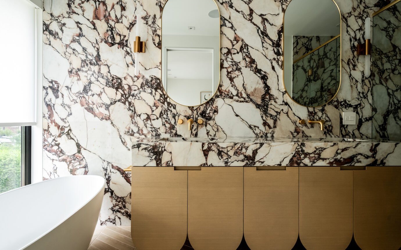
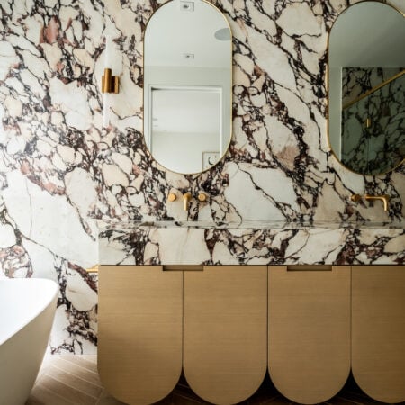
For the homeowner, an art-lover and collector of Canadian art, the Wallace Emerson home had just one more thing to tackle: colour. Inspired by her collection, the team at Picnic pulled the core colour palette for the kitchen and bathrooms from these artworks, which featured mainly natural, muted backgrounds with bright foregrounds. In the kitchen, Picnic paired neutral colours (white oak and dark black contrasting cabinetry and a white oak floor) with a backsplash of terracotta tile. In the bathrooms, light-coloured appliances and wood cabinetry juxtaposed against blue and green shower tiles, framing the colour.